Petstop & pet portal
Centralizing Pet Care: Simplifying Your Pet's Healthcare Journey
ROLE
Product Strategist,
UI Designer
duration
12 Weeks
YEAR
2023
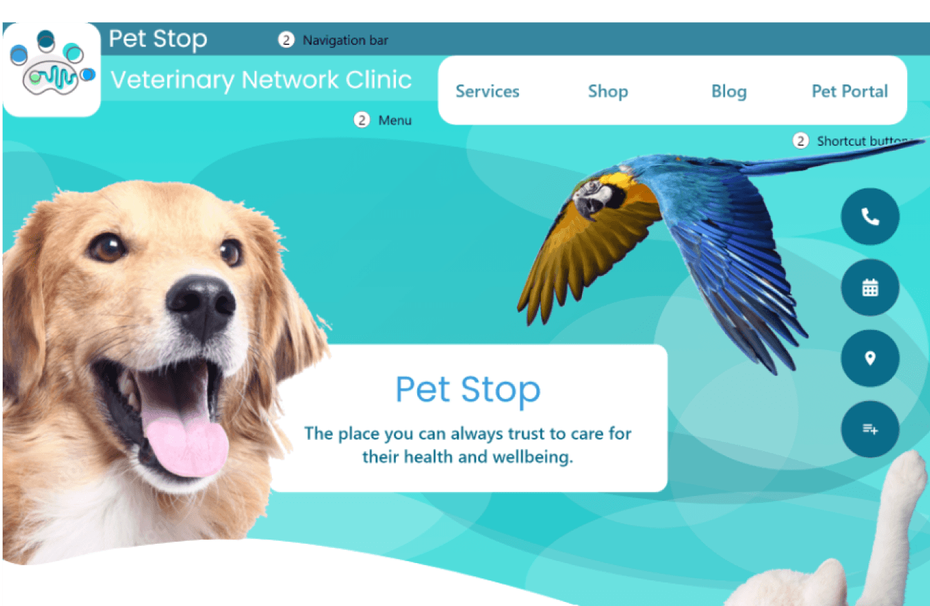
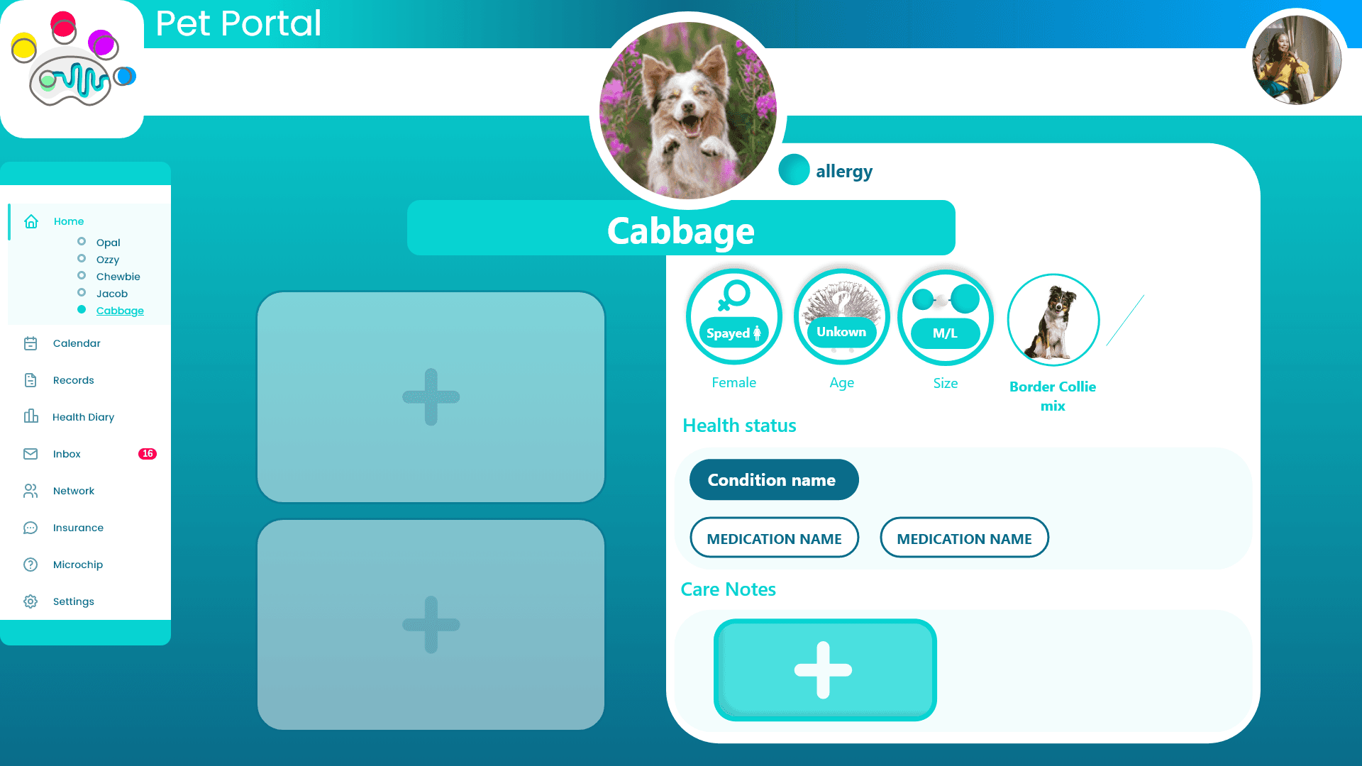
Pet Stop is an innovative holistic veterinary clinic offering a wide range of in-house pet health services. Tasked with designing a landing page and registration flow for the clinic, I recognized broader challenges faced by pet owners. This led me to expand the project scope to create the Pet Portal—a digital platform aimed at centralizing pet healthcare information across a network of veterinary services.
Mission
Design a landing page and registration flow for a veterinary clinic.
Expanding Beyond the Prompt:
Through user research, I discovered that building trust with pet owners required more than a standalone website. By creating a network of trusted veterinary service providers and leveraging referrals and consistent branding, we could offer pet owners peace of mind across multiple locations and services. The Pet Portal emerged as a natural extension to centralize pet health information, accessible by all service providers in the network. This approach minimized tedious aspects like repetitive registrations by creating a single, comprehensive digital profile for each pet.
Background
Pet owners often struggle with:
Fragmented Veterinary Services: Difficulty finding trustworthy services in new locations, especially outside business hours.
Limited Medical History Access: Reliance on owner-provided information leads to incomplete medical histories, hindering effective treatment.
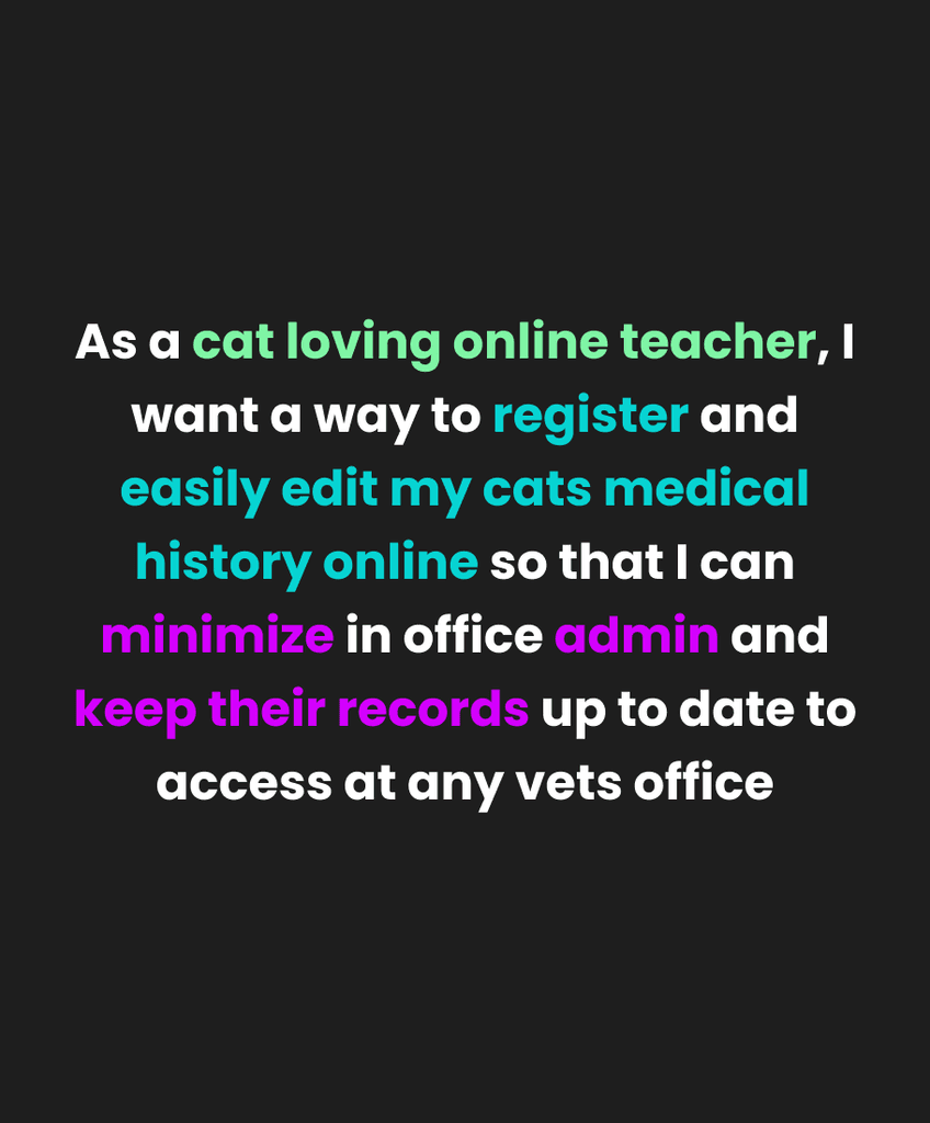
Repetitive Registration Processes: Filling out similar forms for each new provider adds stress, particularly during emergencies.
Difficulty Accessing Essential Information: Cluttered websites make it hard to find vital details quickly.
By developing a networked platform with a centralized Pet Portal, we aimed to address these challenges, enhancing trust, convenience, and continuity of care for pet owners.
Branding and Tone
Create a warm, informative, and fresh landing page that evokes trust.
Develop a visual identity reflecting Pet Stop Clinic's welcoming atmosphere.
Make vital information easy to access.
Engaging Registration Flow
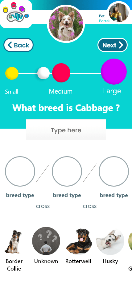
Design an easy-to-use registration flow accessible by all network services.
Simplify the process to be quicker and more user-friendly.
Allow remote completion of pet registration prior to appointments.
Pet Portal for Medical Histories
Create a Pet Portal storing digital documentation of each pet's medical history.
Ensure the portal is secure, password-protected, and easy to use.
Enable remote access and easy addition of information, with exportable PDFs.
Immediate Access to Key Actions
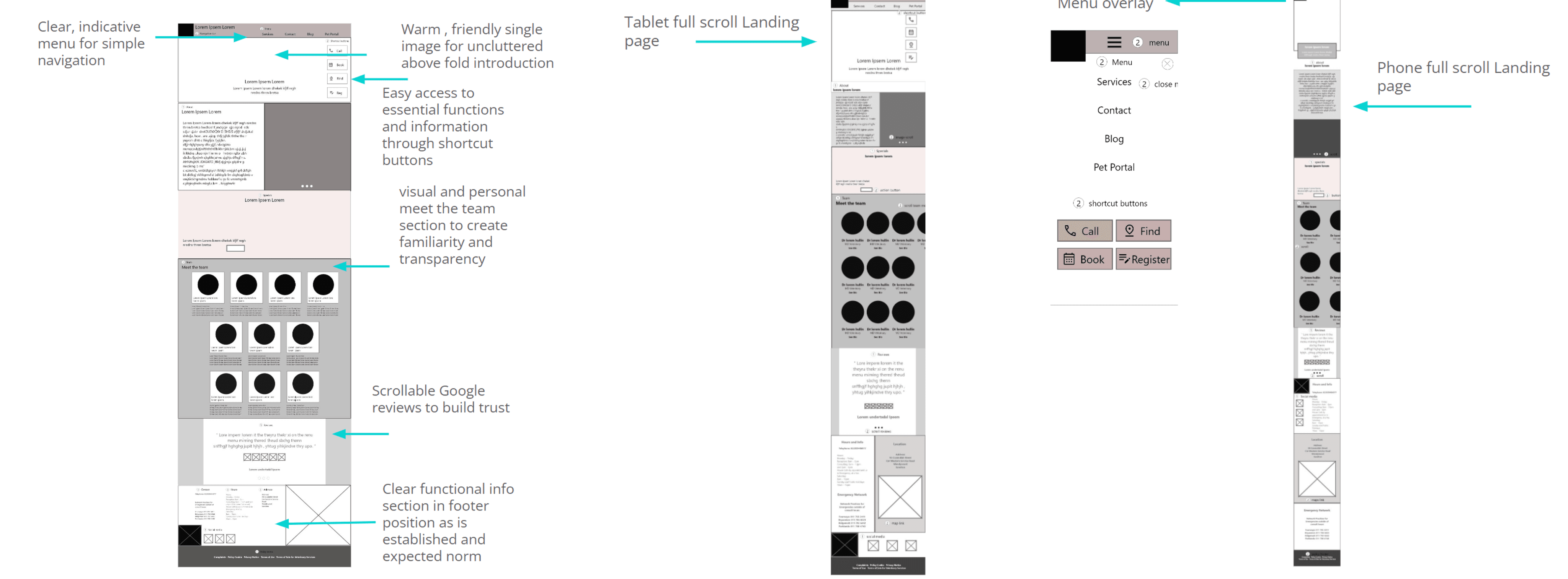
Implement a sticky shortcut button on the landing page for quick access to emergency numbers and vital information, preempting the most utilized sections.
Action Shortcuts
Essential information and services accessible directly from the landing page.
One-Time Registration
A single registration process valid across all linked service providers.
Remote Registration
Digital pet registration that can be completed remotely, reducing in-person wait times.
Pet Bio
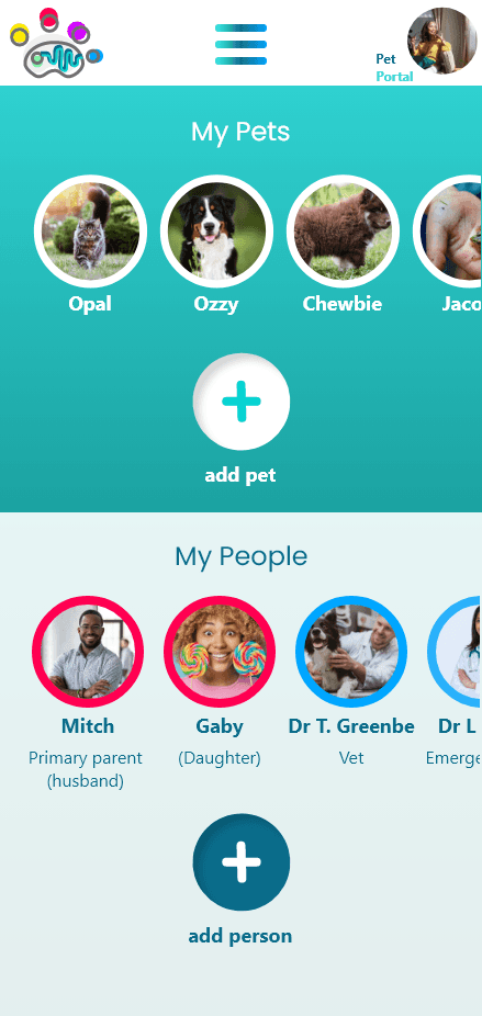
Vital information organized in accessible pet profiles.
Digital Medical Records
Secure storage of pets' medical histories, accessible remotely and exportable.
Network List
A directory of pets, service providers, and carers on the Pet Portal homepage.
Here, the outcomes and achievements of the project are highlighted, including user feedback, metric changes, and projected impact inline with business goals.
Metric Summary
Task Completion Rate: Increased from 80% to 95%.
Average Time on Task: Reduced by 30%, indicating efficient navigation.
User Satisfaction (SUS Scores): Improved from 70 to 85 out of 100.
Error Rates: Decreased by 50%, with fewer issues encountered.
Positive User Feedback
"The website was easy to navigate; registering my pets online is the way it should've always been."
"Having all my pet's medical records in one place is a game-changer."
"The emergency sticky button is brilliant—I can find the number immediately."
"Visual icons helped me quickly see available services without reading lots of text."
Projected Impact
Reduced Wait Times: Remote registration may reduce clinic wait times by 40%.
Increased Trust: Clear service information and pricing could boost new client registrations by 30%.
Enhanced Engagement: A user-friendly portal may lead to 70% of users accessing it monthly.
Improved Emergency Response: Quick access to emergency info could improve response times by 50%.
This category details the step-by-step approach taken during the project, including research, planning, design, development, testing, and iteration phases following double diamond process.
Research & Planning
Shadowed Registration Processes: Observed pet registration at three veterinary clinics to map current procedures and identify business needs.
Expert Interviews: Conducted interviews with animal health professionals and their teams to gain insights.
Competitive Analysis: Evaluated similar products to identify mechanisms that provide peace of mind to pet owners, analyzing strengths and weaknesses.
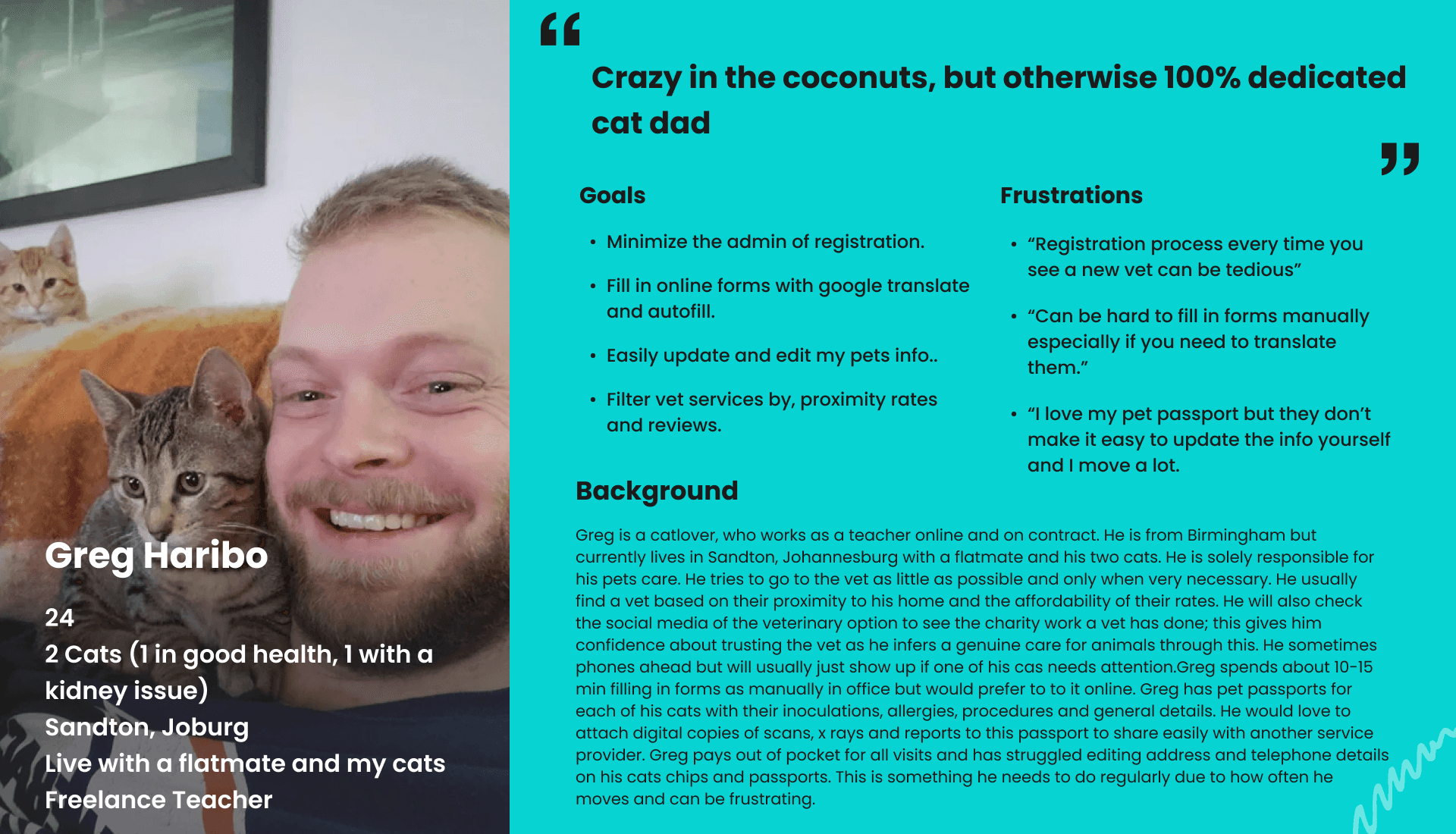
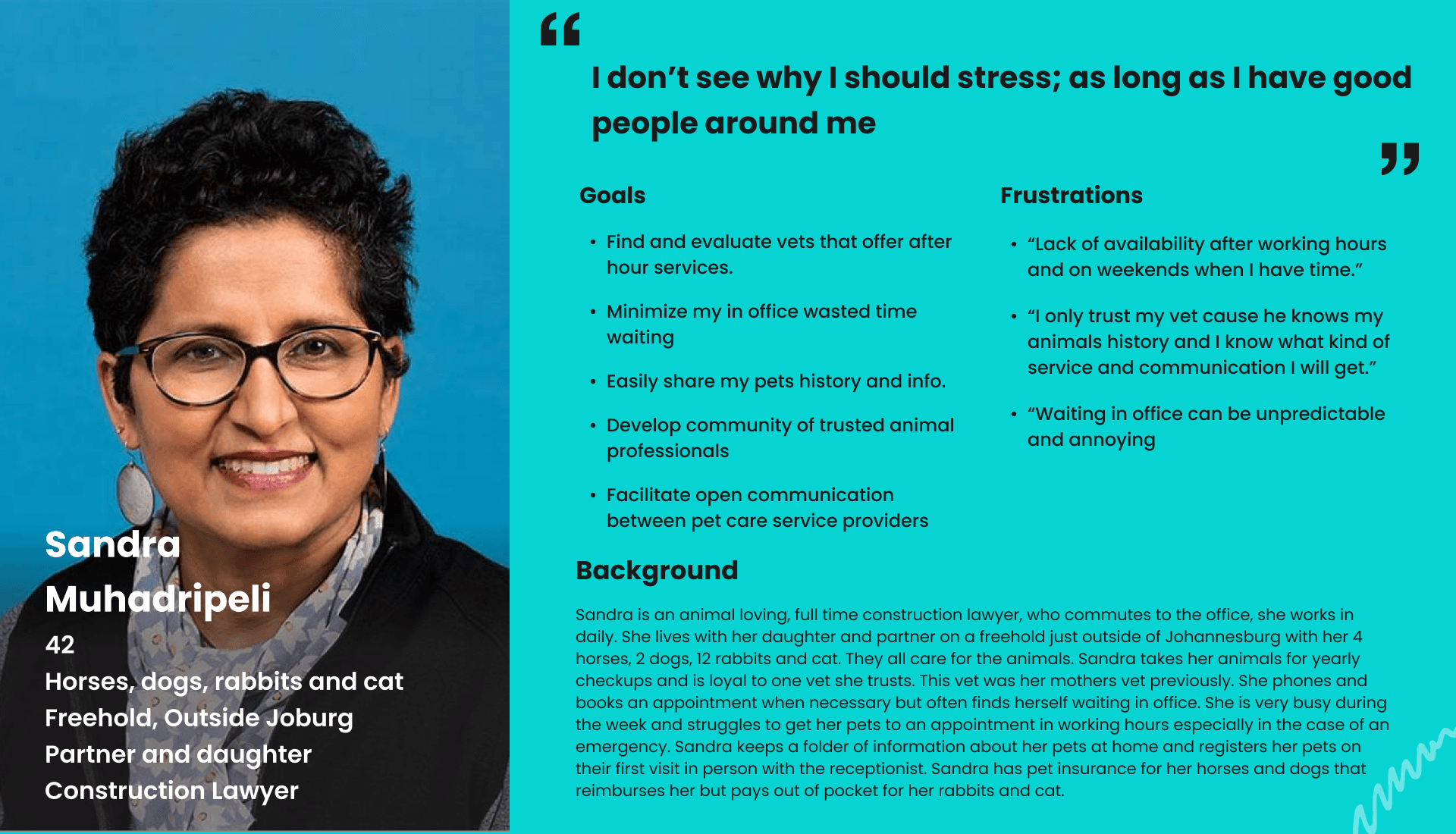
Qualitative Surveys: Gathered experiences from a diverse pool of pet owners and carers, turning findings into empathy maps.
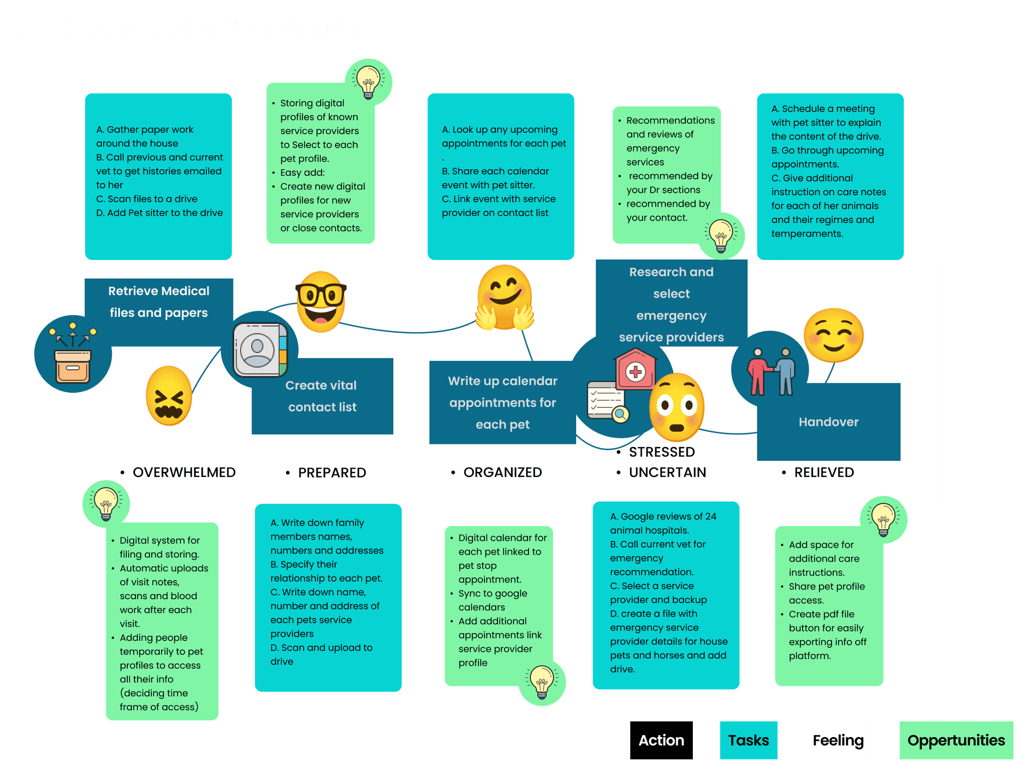
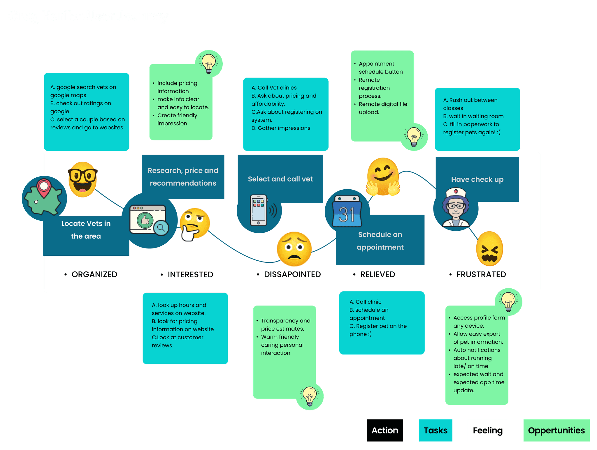
User Journey Maps: Visualized pet owners' experiences to identify pain points and opportunities for improvement.
Key Insights
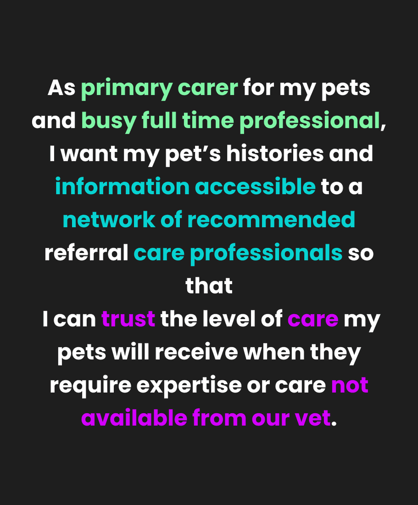
Peace of Mind: Users feel stressed when their trusted provider isn't available, especially during emergencies.
Registration Experience: In-person, repetitive registration is tedious and extends wait times.
Navigation and Transparency: Users struggle to find important information, like pricing and emergency contacts, on cluttered websites.
Information Architecture
To address the identified challenges, I focused on optimizing the information architecture and developing intuitive designs:
Sitemap Development: Prioritized essential information placement to improve navigation and ensure quick access to vital details.
Sticky Shortcut Button: Implemented a sticky shortcut button for immediate access to key actions like emergency numbers and registration, preempting the most utilized sections.
Simplified Registration Flow: Designed the registration flow to focus on one question at a time, avoiding the tedious feel of paperwork and enhancing user engagement.
Ideation and Wireframing
Paper Wireframes: Used to rapidly iterate and visualize ideas, allowing for creative exploration.
Digital Wireframes: Transitioned to Adobe XD to create intuitive navigation models, integrating established conventions.
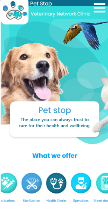
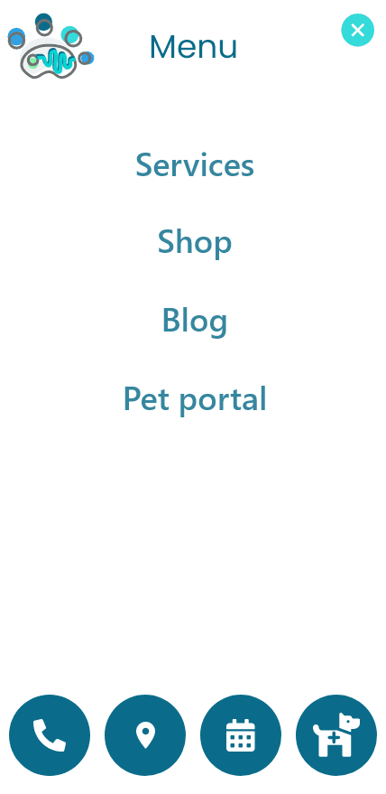
Responsive Design: Optimized layouts for desktop, tablet, and mobile devices to ensure consistency across all platforms.
Sticky Shortcut Integration: Incorporated the sticky shortcut button into digital prototypes to enhance visibility and accessibility, aligning with the goal of making key actions readily available to users.
Testing & Optimization
I conducted a usability study with five participants aged 16 to 78, including individuals with visual and learning impairments to ensure accessibility. Each remote session lasted 20–30 minutes and involved interacting with a live prototype, followed by System Usability Scale (SUS) questionnaires and interviews.
Key Findings and Improvements
Registration Icon Clarity:
Issue: Users didn't identify the registration shortcut due to unclear iconography.
Solution: Redesigned the icon to include an animal and a "+" symbol, adding a hover label.
Impact: Recognition increased by 60%, reducing time on task.
Visual Summary of Services:
Issue: Users were unsure about offered services and avoided large text blocks.
Solution: Added visual icons and headings on the homepage.
Impact: Improved navigation efficiency by 40%.
Sticky Shortcut Button Effectiveness:
Issue: Users needed quick access to emergency information.
Solution: Implemented a sticky shortcut button for immediate access.
Impact: Reduced time to access emergency info by 50%, enhancing confidence.
Engaging Introduction:
Issue: The Pet Portal introduction felt generic and lacked warmth.
Solution: Revised copy with friendlier language and added playful UI elements.
Impact: User satisfaction increased by 25%, with users feeling more welcomed.
By integrating the challenges into our design strategy and focusing on user-centered solutions, we designed a networked platform that addresses key issues faced by pet owners and clinics. The Pet Stop & Pet Portal centralizes information, simplifies registration, and enhances accessibility, providing peace of mind and streamlining pet healthcare. Positive feedback and improved metrics demonstrate significant potential impact on user satisfaction and trust as well as clinic efficiency.
