street art inclusivity app

Redefining Urban Art Engagement: Bringing Street Art to Everyone

ROLE

Product and UX Designer

Duration

16 Weeks

YEAR

2022

Project description

Project description

Project description

In a world where time for art appreciation is scarce, the Street Art Inclusivity App reimagines how people experience and engage with street art. This inclusive platform aims to document, curate, and showcase street art as an integral part of urban history—breaking down the exclusivity often associated with art and making it accessible to everyone.

Mission

Originally tasked with designing an art history app, I identified a significant gap in the recognition of street art. Through extensive research, it became clear that street art is frequently overlooked in traditional art narratives. Street Art Inc. bridges this gap by utilizing audio geotags and augmented reality to guide users in exploring real-world environments, transforming their experiences into culturally rich and interactive entertainment.

Background

Developed to address the exclusion of street art from traditional art history, the Street Art Inc. App emerged from comprehensive research and analysis. A competitive analysis and user interviews, totaling 237 data points, revealed that street art often lacks recognition and documentation, perpetuating its status as a marginalized and transient art form. Key challenges identified included:

  • Safety Concerns: Users expressed apprehension about navigating urban areas where street art is located.

  • Limitations of In-Person Tours: Time, cost, and language barriers make traditional tours inaccessible for many.

  • Stigma of Vandalism: Street art is sometimes dismissed as vandalism or vulgarity, deterring potential audiences.

Importantly, the inherent accessibility of street art offers a unique opportunity to democratize art history while alleviating pain points for art enthusiasts and travelers, such as affordability and the freedom to explore independently. These findings directed the mission to create an app that documents and engages users with urban art, amplifying voices and creativity often overlooked in conventional narratives.

Research also uncovered two distinct user engagement preferences:

  1. Routine, Brief Engagements: Users who prefer short, frequent interactions within familiar settings.

  2. Longer, Immersive Experiences: Users seeking extended explorations in new or temporary environments.

These insights shaped the app's features and functionality, ensuring it caters to diverse engagement styles and enhances access to and appreciation of street art.

Process

This category details the step-by-step approach taken during the project, including research, planning, design, development, testing, and optimization phases.

Research & Planning

Since volunteering and altruism already had a broad base of study within academia, I started by evaluating secondary research. This was contextualized for the South African market, focusing on how volunteering plays a role in local communities.

Research Summary:

Qualitative Interviews: Conducted 6 interviews with 35 questions, resulting in 275 data points. These interviews aimed to understand the role and function of volunteering in South Africa.

  • Empathy Mapping: Developed 4 empathy maps from the data (does, says, thinks, feels), leading to 4 distinct user personas informed by behaviors, environments, and beliefs.

  • Problem Statements: Identified 36 key problem statements, prioritizing 6 for targeted design solutions.

  • User Journey Mapping: Created 2 detailed user journey maps with 7 actions visualized across 6 categories, leading to an additional 182 data points.

  • Competitive Analysis: Studied 4 competing products across 13 categories, collecting 52 data points, allowing a deep dive into existing solutions and gaps.

In total, 549 data points were analyzed, informing the design direction for Do Good.

Key Problem Analysis:

Problem Analysis:
From the research, several key pain points emerged among individuals who wanted to volunteer:

  • Inconsistent Volunteering: Individuals from diverse backgrounds often do not volunteer regularly due to perceived barriers.

  • Complexity in Finding Opportunities: Many see finding reliable opportunities as laborious and time-consuming.

  • Accessibility Concerns: Volunteering is seen as inaccessible due to physical abilities and time constraints.

  • Commitment Issues: People desire to spend time meaningfully but are discouraged by the perceived effort and long-term commitment required to find suitable opportunities.

The research suggested that simplifying the process, reducing admin burdens, and providing personalized matches would significantly increase volunteer participation.

Design & Prototyping

We designed the Do Good platform’s core flows around user personas and journey maps, emphasizing user-friendly sign-up processes and task filtering to match preferences. The user flow covered the full cycle from signing up for a task to hour tracking and reward collection.

The branding was fun, clean, and punchy, reflecting the platform’s playful tone with a quirky mix of tech-style sliders and the “Do Good” logo. We focused heavily on categorizing tasks and presenting information in summary cards with clear blocks, improving clarity and efficiency.

Key aspects included:

  • Task Filters: Integrated filters by refrencing design solutions used by Google Maps iwhich ranked highly n the competitive audit for this segment, for location, task type, and preferences.

  • User-First Design: We ensured flexible options while maintaining low cognitive load, making it easy for users to refine search results without feeling overwhelmed.

Testing & Optimization

The testing phase included remote usability tests via Google Meet, focusing on refining filters, summary cards, and improving system usability. We utilized System Usability Scale (SUS) scores, time-on-task data, and qualitative interviews to identify areas of improvement.

Notable results:

  • SUS Improvement: Overall score improved by 3 points, with each feature showing a 2-point improvement. This indicated better user satisfaction and ease of use across the board.

  • Efficiency Gains: Task filtering and identification time reduced by 40%, streamlining the user experience.

  • Feature Refinements: Based on user feedback, we added geolocation features to track volunteer hours more reliably. WhatsApp was integrated as a contact method, preferred by users, improving communication between volunteers and organizations.

Goals

  • Democratize Art History: Include street art in the historical canon by documenting and promoting it.

  • Enhance Urban Exploration: Enable users to discover and interact with street art effortlessly.

  • Flexible User Experience: Cater to both local enthusiasts and travelers with customizable engagement options.

  • Leverage Technology: Use geo-location audio tags and augmented reality to enrich real-world exploration.

  • Preserve Ephemeral Art: Create a living catalogue of street art before it disappears.

Solutions

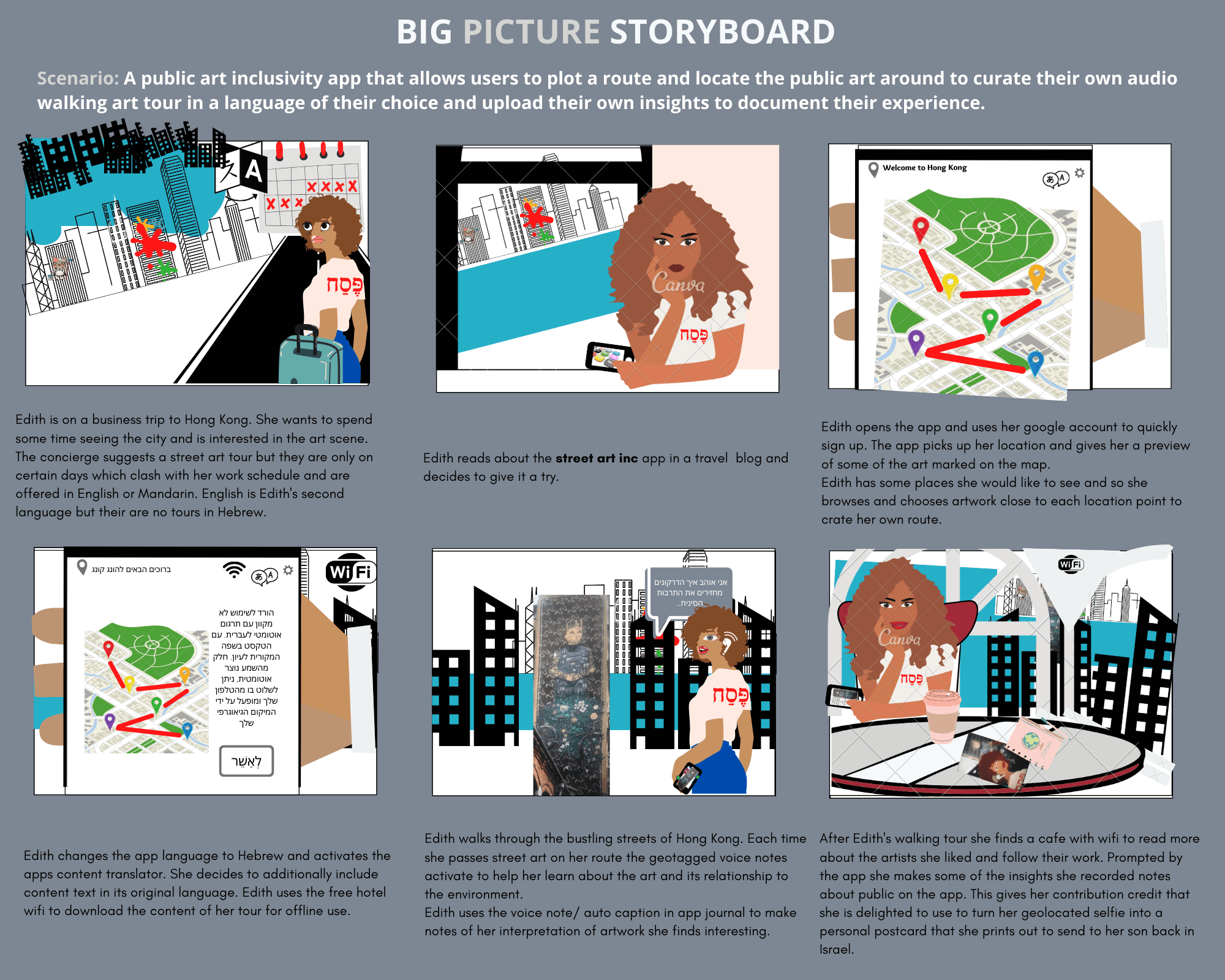
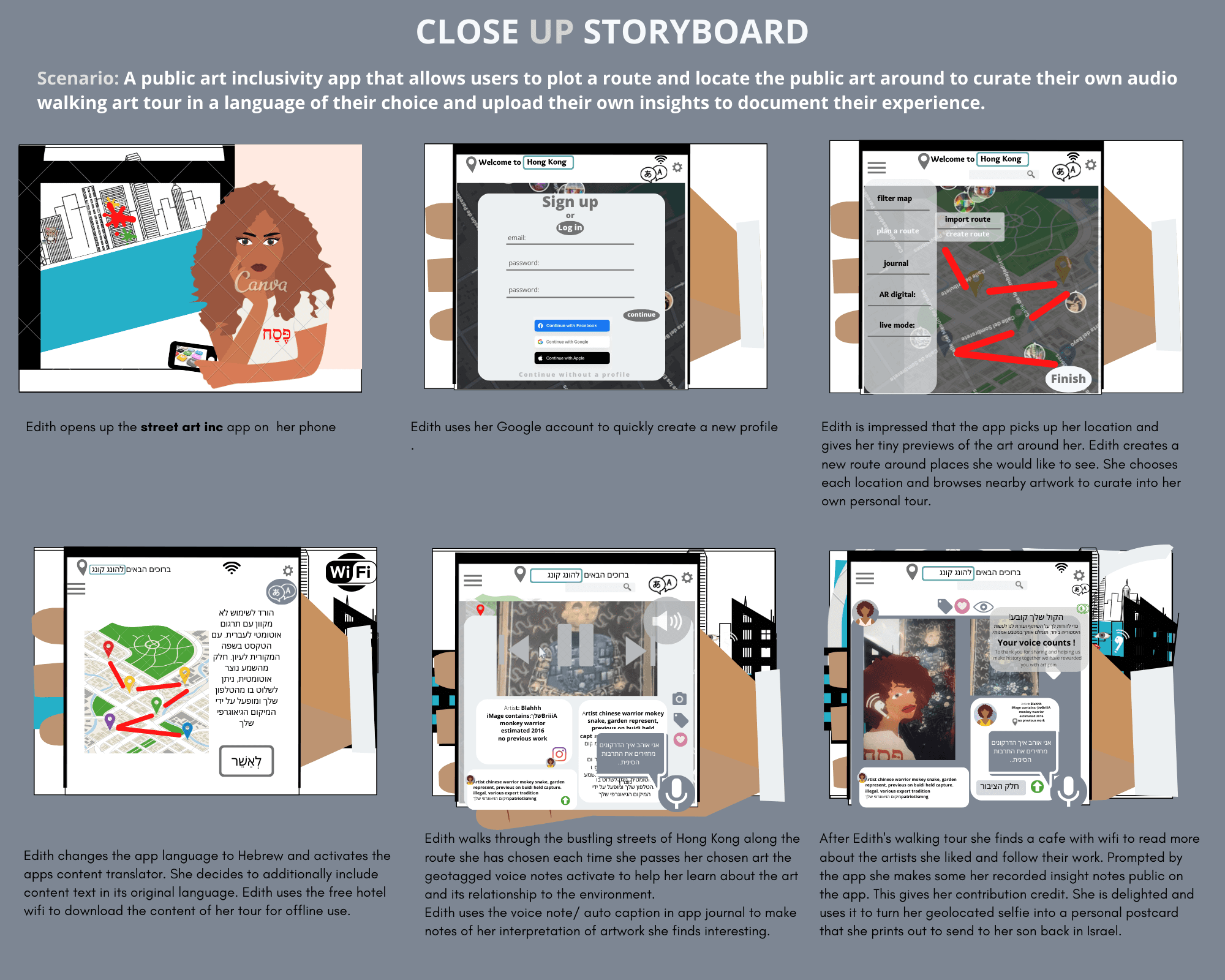
The Street Art Inc. App addresses key problems identified during the research phase. The solutions focus on making street art accessible, engaging, and inclusive for a broader audience:

Harnessing Community Documentation

Empowering users to document street art in real time, creating a crowdsourced, living catalogue of artwork outside traditional gallery spaces. This preserves ephemeral pieces often erased or painted over, allowing users to engage with the evolution of urban art—even artworks they haven't seen in person.

Curated Content & Entertainment

Transforming urban exploration through curated content, customizable tours, and geo-tagged audio insights. Users can create personalized tours or select ready-made options, enhancing discovery and blending education with entertainment.

Augmented Reality Experience

Integrating geo-location audio tags to provide an augmented reality experience that enhances and encourages real-world exploration. As users navigate the city, they receive audio narratives and contextual information about nearby artworks, architecture, and public art, enriching their understanding and engagement..

Personalization

Designed for both quick, routine interactions and immersive experiences, the app adapts to user preferences, ensuring a personalized and enriching engagement with urban art. It makes art accessible without high costs or time constraints, appealing to a wide audience.

By integrating these solutions, the Street Art Inc. App not only democratizes access to art but also transforms how individuals experience and engage with their city’s cultural landscape.

  • Discover and Preview

    Use interactive map to locate Street Art, Architectural sites and Public Art anywhere.

  • Explore events and Informal performance

    The feed format lets you find what matters to you at a glance.

  • Create and share custom tours

    Allowing you total control and the ability to share your uniquely curated and narrated experience.

  • Choose from curated tours in our community

    Benifit from local guides or explore a specific theme by selecting a premade tour.

  • Geo Audio tags for enhanced engagement

    Emmerse in the enviroment by unlocking the location based audio tags

  • Document on the go and have your say

    Quicly record new artwork you've discovered on the mad and let our audio transcribing notes record your valuable insights and thoughts.

Results

Results

Results

Here, the outcomes and achievements of the project are highlighted, including user feedback, usability metrics and projected impact.

Enhanced Usability Metrics

  • Task Completion Rate: Increased from 80% to 95% after iterations.

  • Average Time on Task: Reduced by 30%, indicating more efficient navigation.

  • User Satisfaction (SUS Scores): Improved by 15%, reflecting higher user satisfaction.

  • Net Promoter Score (NPS): Increased from 40 to 65, indicating a higher likelihood of users recommending the app.

Positive User Feedback

"The app met all my expectations; everything I'd want was there. I really liked the safety notes—they're super useful."

"Setting up my own tours is very important to me. I don't like being dictated to."

"It's important that you can preserve artwork that's going to fade into nothing."

"I think it's fantastic and so useful. It makes your experience of a place so much richer."

Projected Impact

Increased Engagement with Street Art:

  • The app has the potential to significantly enhance public interaction with urban art.

  • 90% of participants indicated they would use the app regularly and recommend it to others.

Community Contribution and Growth:

  • Encouraging users to document and share street art can lead to a rich, community-driven art history resource.

  • Anticipated that 70% of users will contribute content, enhancing the app's value.

Cultural Preservation:

  • Aids in preserving ephemeral artworks that might otherwise be lost, fostering appreciation for transient art forms.

  • Potentially cataloging over 10,000 artworks in the first six months post-launch.
Process

This category details the step-by-step approach taken during the project, including research, planning, design, development, testing, and optimization phases.

Research & Planning:

To empathize with users and understand the challenge's scope, I conducted comprehensive research:

  • Secondary Research: Reviewed existing literature on street art and public engagement.

  • Competitive Analysis: Analyzed similar platforms to identify market gaps.

  • Expert Interviews: Conducted 5 interviews with artists, art experts, and tourism leaders using 32 open-ended questions.

  • User Interviews: Interviewed 8 potential users with 24 demographic questions and 26 open-ended questions to identify pain points and behaviors.

This research yielded 237 data points and led to key insights that shaped the app's development.

Key Insights:

  • Exclusion from Art History: Street art lacks recognition and documentation in traditional narratives.

  • Information Access Challenges: Difficulty in locating and accessing information about street art limits engagement.

  • Constraints of In-Person Tours: Time, language, and cost barriers hinder exploration.

  • Safety Concerns: Users are cautious about exploring unfamiliar urban areas without guidance.

  • Diverse Engagement Preferences: Need to accommodate both brief and immersive interactions.

Design Approach

To address the needs of our primary users—Art Enthusiasts seeking regular engagement in familiar environments and Culture-Curious Travelers desiring immersive cultural experiences—I developed user personas and journey maps to visualize their experiences and identify opportunities for improvement. Employing ideation techniques such as How Might We Questions to stimulate innovative thinking, Crazy 8's for rapid, diverse idea generation, and Storyboarding to create coherent visions and detailed user flows, I crafted a design strategy tailored to enhance user engagement with street art.

Design & Prototyping

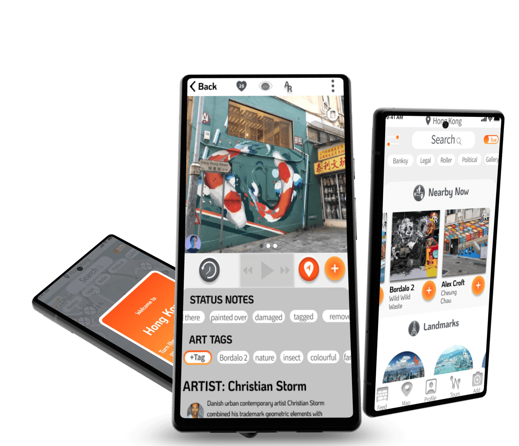
Using Figma, I created low-fidelity wireframes focusing on key features:

  • Map-Style Homepage: Emphasizes geographical relationships to encourage exploration.

  • Search Functionality and Filters: Allows users to find specific artworks or areas and customize content based on interests and safety preferences.

  • Artwork Previews: Provides quick visual insights with images, descriptions, and options like "mark as seen" or "add to tour."

  • Augmented Reality Features: Integrates geo-location audio tags to offer contextual information as users navigate the city.

  • View Past Artworks: Introduces a "Turn Back Time" feature to view previous artworks at a location, acknowledging the transient nature of street art.

Key Design Decisions

  • Geo-Location Audio Tags: Implemented to create an immersive augmented reality experience, offering audio insights as users approach artworks.

  • Customizable Tours: Enabled users to create or select tours based on interests, time, and location.

  • Safety Features: Included options to filter content and receive safety tips, addressing user concerns about urban exploration.

  • User-Friendly Interface: Focused on intuitive navigation, clear visual hierarchy, and minimal cognitive load to ensure a seamless user experience.

Testing & Optimization

To refine the design and enhance user experience, I conducted a moderated usability study with five participants aged 20 to 66, including individuals with visual and learning impairments to ensure accessibility. Each remote session lasted 30–60 minutes and involved interacting with a live prototype, followed by System Usability Scale (SUS) questionnaires and in-depth interviews.


Key Findings and Improvements

  • Simplified Navigation: Changed selection from double-click to single tap after 80% of users were confused, improving task completion rates by 20% and enhancing intuitiveness.

  • Play Button Confusion: Removed the persistent play button from the main navigation, placing it contextually instead, which reduced navigation confusion by 40% and led to smoother user flows.

  • Enhanced Accessibility: Increased text and icon sizes and improved contrast ratios after users with visual impairments faced difficulties, resulting in a 35% improvement in accessibility scores and a more comfortable experience.

  • Audio Tag Controls: Modified audio tags to require user initiation when 40% of users found automatic triggers intrusive, increasing satisfaction with audio features by 30%.

  • Clarified Iconography and Terminology: Standardized terminology (choosing between "routes" and "tours") and added supportive text to the microphone icon to resolve confusion, improving navigation clarity and recognition of the recording feature by 50%.

Process

This category details the step-by-step approach taken during the project, including research, planning, design, development, testing, and optimization phases.

Research & Planning

Since volunteering and altruism already had a broad base of study within academia, I started by evaluating secondary research. This was contextualized for the South African market, focusing on how volunteering plays a role in local communities.

Research Summary:

Qualitative Interviews: Conducted 6 interviews with 35 questions, resulting in 275 data points. These interviews aimed to understand the role and function of volunteering in South Africa.

  • Empathy Mapping: Developed 4 empathy maps from the data (does, says, thinks, feels), leading to 4 distinct user personas informed by behaviors, environments, and beliefs.

  • Problem Statements: Identified 36 key problem statements, prioritizing 6 for targeted design solutions.

  • User Journey Mapping: Created 2 detailed user journey maps with 7 actions visualized across 6 categories, leading to an additional 182 data points.

  • Competitive Analysis: Studied 4 competing products across 13 categories, collecting 52 data points, allowing a deep dive into existing solutions and gaps.

In total, 549 data points were analyzed, informing the design direction for Do Good.

Key Problem Analysis:

Problem Analysis:
From the research, several key pain points emerged among individuals who wanted to volunteer:

  • Inconsistent Volunteering: Individuals from diverse backgrounds often do not volunteer regularly due to perceived barriers.

  • Complexity in Finding Opportunities: Many see finding reliable opportunities as laborious and time-consuming.

  • Accessibility Concerns: Volunteering is seen as inaccessible due to physical abilities and time constraints.

  • Commitment Issues: People desire to spend time meaningfully but are discouraged by the perceived effort and long-term commitment required to find suitable opportunities.

The research suggested that simplifying the process, reducing admin burdens, and providing personalized matches would significantly increase volunteer participation.

Design & Prototyping

We designed the Do Good platform’s core flows around user personas and journey maps, emphasizing user-friendly sign-up processes and task filtering to match preferences. The user flow covered the full cycle from signing up for a task to hour tracking and reward collection.

The branding was fun, clean, and punchy, reflecting the platform’s playful tone with a quirky mix of tech-style sliders and the “Do Good” logo. We focused heavily on categorizing tasks and presenting information in summary cards with clear blocks, improving clarity and efficiency.

Key aspects included:

  • Task Filters: Integrated filters by refrencing design solutions used by Google Maps iwhich ranked highly n the competitive audit for this segment, for location, task type, and preferences.

  • User-First Design: We ensured flexible options while maintaining low cognitive load, making it easy for users to refine search results without feeling overwhelmed.

Testing & Optimization

The testing phase included remote usability tests via Google Meet, focusing on refining filters, summary cards, and improving system usability. We utilized System Usability Scale (SUS) scores, time-on-task data, and qualitative interviews to identify areas of improvement.

Notable results:

  • SUS Improvement: Overall score improved by 3 points, with each feature showing a 2-point improvement. This indicated better user satisfaction and ease of use across the board.

  • Efficiency Gains: Task filtering and identification time reduced by 40%, streamlining the user experience.

  • Feature Refinements: Based on user feedback, we added geolocation features to track volunteer hours more reliably. WhatsApp was integrated as a contact method, preferred by users, improving communication between volunteers and organizations.